
ST PETER'S CEP SCHOOL — BRAND IDENTITY CASE STUDY


The starting point
In 2021, St Peter's CEP School moved from its original home on Windmill Road in Tunbridge Wells to a newly built site in Hawkenbury. The move was significant, not just logistically, but symbolically. The old logo was a windmill, a direct reference to the school's previous address. With the move came an opportunity and a responsibility: to build a brand identity that reflected who the school truly is, not simply where it used to be.
The school had been part of the Tunbridge Wells community since 1842. Its vision, "Learning to Light the Way," is underpinned by its Christian foundation and its connection to St Peter's Church on Bayhall Road. Its values of Courage, Compassion and Respect shape everything from how teachers lead to how children treat each other. What was needed was a visual identity that could carry all of that into a new chapter, with integrity and permanence.
That is where On The Dot came in.
Where the work began
The project started not at a desk but at the school itself. Eva visited the newly built site at Hawkenbury to photograph the space, walk the grounds and find the visual language that was already there, waiting to be discovered.

What emerged from those early visits was a set of themes that would guide everything that followed: the light, both spiritual and literal, that runs through the school's vision and its connection to the church. The landscape, the rolling Kentish countryside surrounding Hawkenbury, and the bluebell woods that are characteristic of this part of Kent. The community, the sense of every child belonging, being nurtured, being valued. And the faith, the quiet but constant presence of the school's Christian foundation.
These four themes became the foundation of the entire identity.
The design journey
The visual development was not a straight line. It was a genuine exploration.
The team began with the symbol that felt most true to the school's heart: hands holding light. Open, cupped hands offering a star of light upward, referencing both the Christian concept of divine guidance and the school's vision of lighting the way for every child. It was powerful but on its own it felt incomplete.

Bluebells were introduced next, the wildflower native to the Kentish woods surrounding the school, delicate and distinctive, representing nature, place and the quiet growth of children learning over time. The bluebell vines brought life and movement to what had been a more static composition.
Various structures were explored: a garland forming a wreath, a ribbon banner, a heraldic crest with four symbolic quadrants. Each one captured something true.

But the final mark, the logo that would live on uniforms, signage, the main door, and in the minds of the school community, came from pushing further.
The final mark

The circle itself represents inclusion. Wholeness. The idea that every child belongs, that no one is outside the community. It is a complete, unbroken form.
At the centre sits a cross, rendered in gold. This is simultaneously the Christian cross at the heart of the school's faith, and a direct visual reference to the cross of St Peter's Church on Bayhall Road, creating a permanent visual bond between the school and the church that has been part of its story since 1842.
Radiating from the cross is a star of light, also in gold. This is the light of "Learning to Light the Way." It is the guiding light the school offers every child who comes through its doors.
Wrapped around the lower half of the circle, the bluebell vines grow. They are not decorative. They represent the natural landscape of Hawkenbury, the Kentish countryside the children play in and belong to, and the organic, unhurried growth of learning over time.
The school name arches across the top of the circle in navy, completing the form. Contained. Complete. Whole.
The palette of navy and gold gives the identity both weight and warmth. It feels rooted in tradition and ready for the future at the same time.
The logo was finally and officially presented to the families in December 2024 https://www.youtube.com/watch?v=M6ywJL-1ePo&t=98s
A complete visual system
A logo alone is not an identity. The work at St Peter's went much further.

Alongside the logo, a full visual system was established: a colour palette across navy, periwinkle blue, sky blue, olive green and warm gold, all drawn from the natural environment surrounding the school, and typography carefully chosen to balance formality with warmth.
Working with a local supplier, the uniforms were then designed and embroidered with the official logo, bringing the identity into the daily life of every child at the school.
The house identities
The second phase of the project extended the brand into the school's house system. St Peter's has four houses, each named after a local park or green space in Tunbridge Wells: Grove, Calverley, Dunorlan and Hawkenbury.
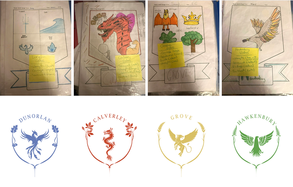
Each house needed its own identity, rooted in the same visual language as the school brand but distinctive and meaningful on its own terms.
The process here was genuinely collaborative. The children of the school drew their own designs, expressing what they felt their house stood for. On The Dot took those drawings as the starting point, finding the symbols and the stories within them, and developed four individual house logos, each carrying its own character while remaining unmistakably part of the same family.
From screen to walls
The final phase of the project was the one that made it real. The identity needed to live in the building, not just on a screen.
Wall stickers, vertical banners carrying the school values — Be Kind, Be Ready, Be Safe, Be Respectful — and window graphics for the main entrance were all designed, produced and applied.

In April 2026, Eva visited the school to to support with the fitting, bringing a two-year project to its physical conclusion.
The result is a school that looks like itself. Every corridor, every uniform, every piece of communication now carries the same visual language, telling the same story about who St Peter's CEP School is and what it stands for https://www.instagram.com/reel/DU2izqojfI0/?igsh=MWdnaHd4aTNlNHR0dg==
What this project represents
A brand identity for a school is not decoration. It is a statement of values made visible. It is what prospective families see before they visit, what children absorb every day as they walk through the corridors, what the community recognises as belonging to them.
The journey from the windmill logo to the circle took two years because it needed to. A school with 180 years of history and a newly built home deserved an identity that was thought through properly, not produced quickly.
St Peter's CEP School now has that identity. And it will be with them for years to come.
Working with On The Dot
On The Dot is a business management and marketing consultancy based in Tunbridge Wells. We work with schools, hospitality businesses, events and brands across Kent and London, supporting them with strategy, brand identity, marketing and communications.
If you would like to discuss how we could support your school, we would love to arrange a conversation.
Contact us at info@onthedot.online or book a free discovery call at www.onthedot.online/contact

Comments